
Fleur
Fleur

The product
Fleur is a flower delivery service that allows users to purchase affordable, fresh flowers anywhere at any time without leaving their home.
Problem
Users do not have the time or access to easily purchase fresh flowers.
Goal
Design a service that will allow users to easily purchase fresh flowers online to be delivered to their door.
My role & responsibilities
UI/UX Designer in charge of:
- Conducting interviews
- Wireframes (paper and digital)
- Lo-fi and hi-fi prototypes
- Usability tests
- Visual design
Timeline
4 months
Understanding the user
User research: summary
Through multiple interviews and studies it was revealed that aside from a lack of interest in flowers: time, cost, and accessibility were some factors that stopped users from purchasing flowers.

User research: pain points
Time - For most people, flowers aren’t a necessity in life. Users often have to go out of their way to purchase some flowers.
Accessibility - Users with mobility issues or live far away from a flower shop or supermarket don’t have access to fresh flowers.
Cost - Flowers aren’t cheap. A large part of the expense comes from the freight costs of transporting flowers from the farms to florists.
Quality - Flowers at the supermarket often aren’t fresh because they’ve been left out all day without proper care.
So then, how can I come up with a service that would make purchasing flowers more accessible?
Wireframing
Paper wireframes: mobile first
Sketching out wireframes on paper allowed me to organize my thoughts and make quick changes. I sketched out different possibilities for how the home screen could look like. After I had a good variety, I went back and drew a star next to the features I liked best. Then I made a refined sketch of the home screen utilizing the starred features. When I felt satisfied with how the refined sketch looked, I moved onto making digital wireframes.

Digital wireframes
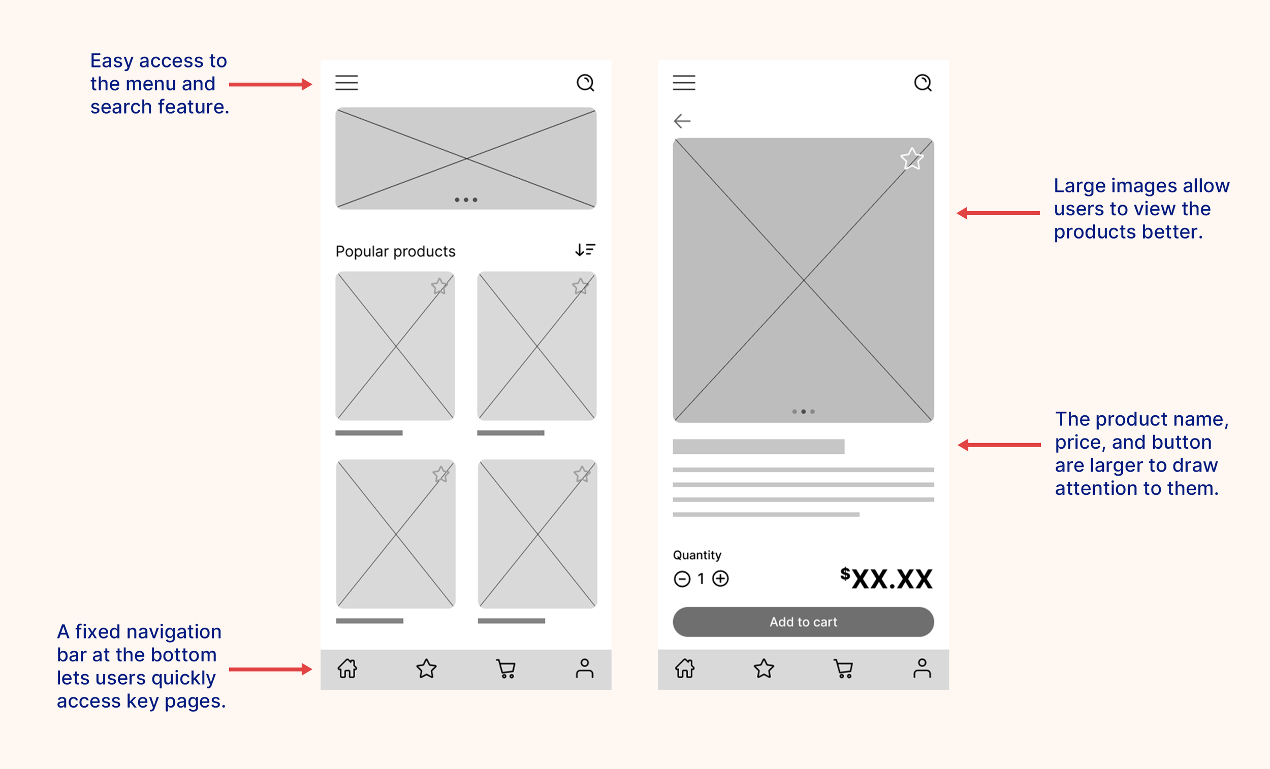
Digital wireframes were created for each screen. Moving from paper to digital helped me get a better understanding of how text and images would work together on a screen. Hierarchy was used to create emphasis and organize the elements on the page.
Low-fidelity prototype
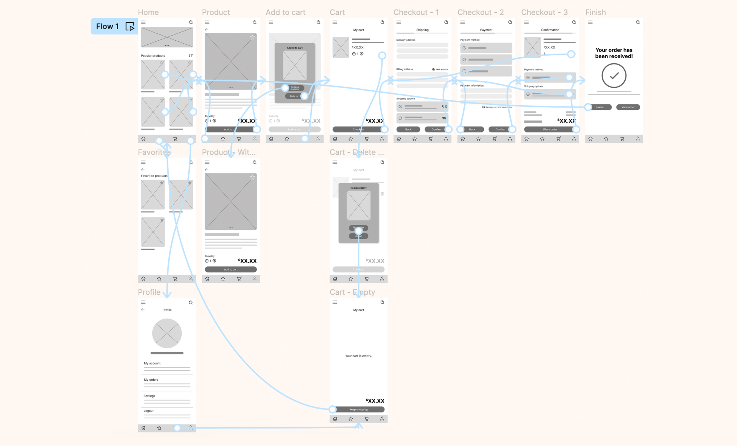
After completing the digital wireframes, I linked up all of the screens and created a low-fidelity prototype. The primary user flow is for viewing a product, adding it to the cart, and checking out.
The low-fidelity prototype was later used for the usability study.
Usability study 1
Usability study: overview
A remote, unmoderated usability study was conducted using the low-fidelity mobile app prototype. The study involved 5 individuals located across the United States and took each user about 10-15 minutes to complete.
Users were given instructions to follow and a set of questions to answer after completing each step. Users were told to add an item of their choice to the cart and complete the check-out process.
Usability study round 1: findings
Round 1 findings
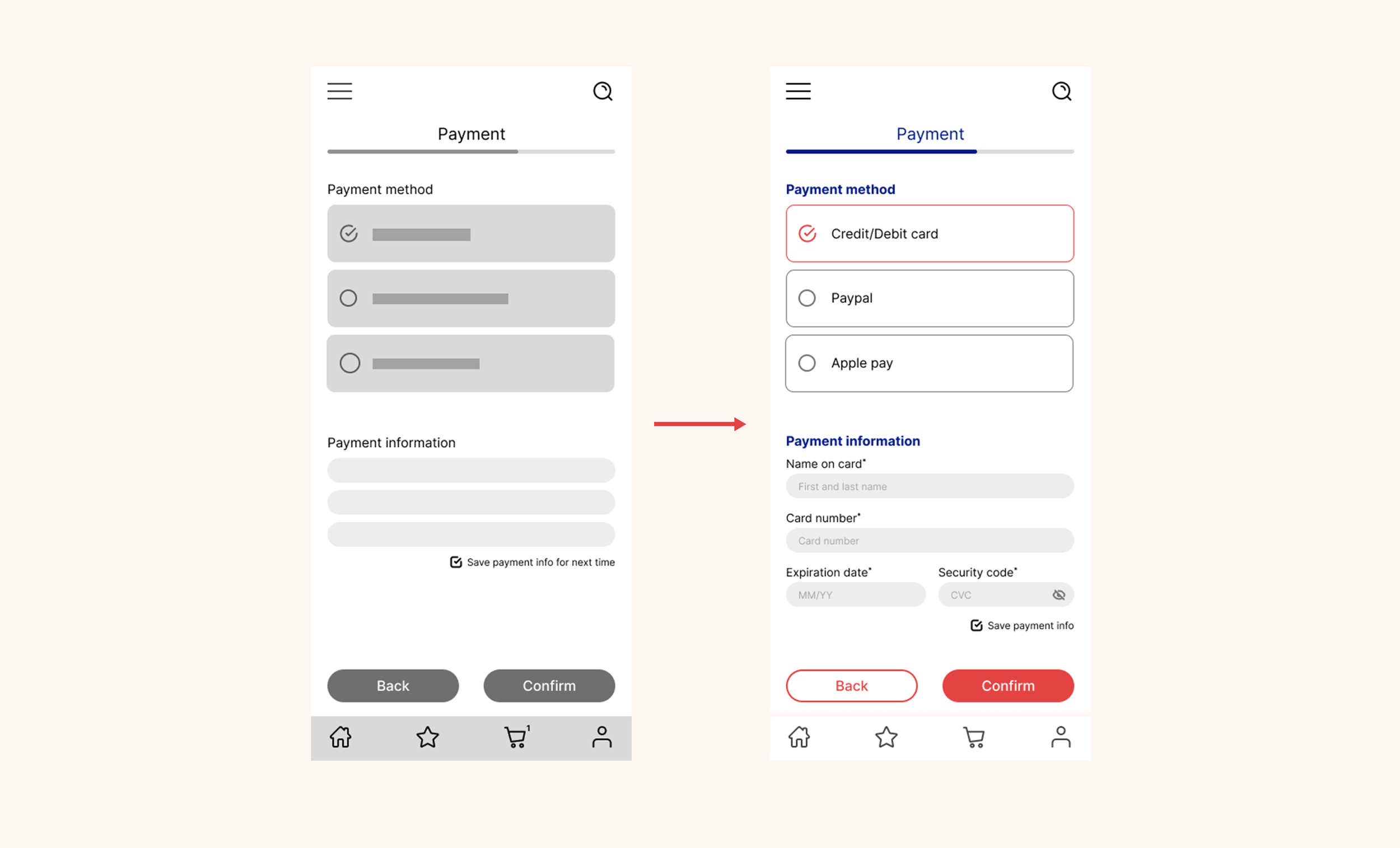
2 out of the 5 users wanted to view their order right after completing their purchase.
Users gravitated towards using the navigation bar over other forms of navigation.
Users may not necessarily go straight to their cart after adding something to it.
Refining the design
After the first round of usability testing, I moved onto making mockups that incorporated my findings from the usability study. During the creation of the mockup, various design elements such as color and images were added into the design.
UI style guide
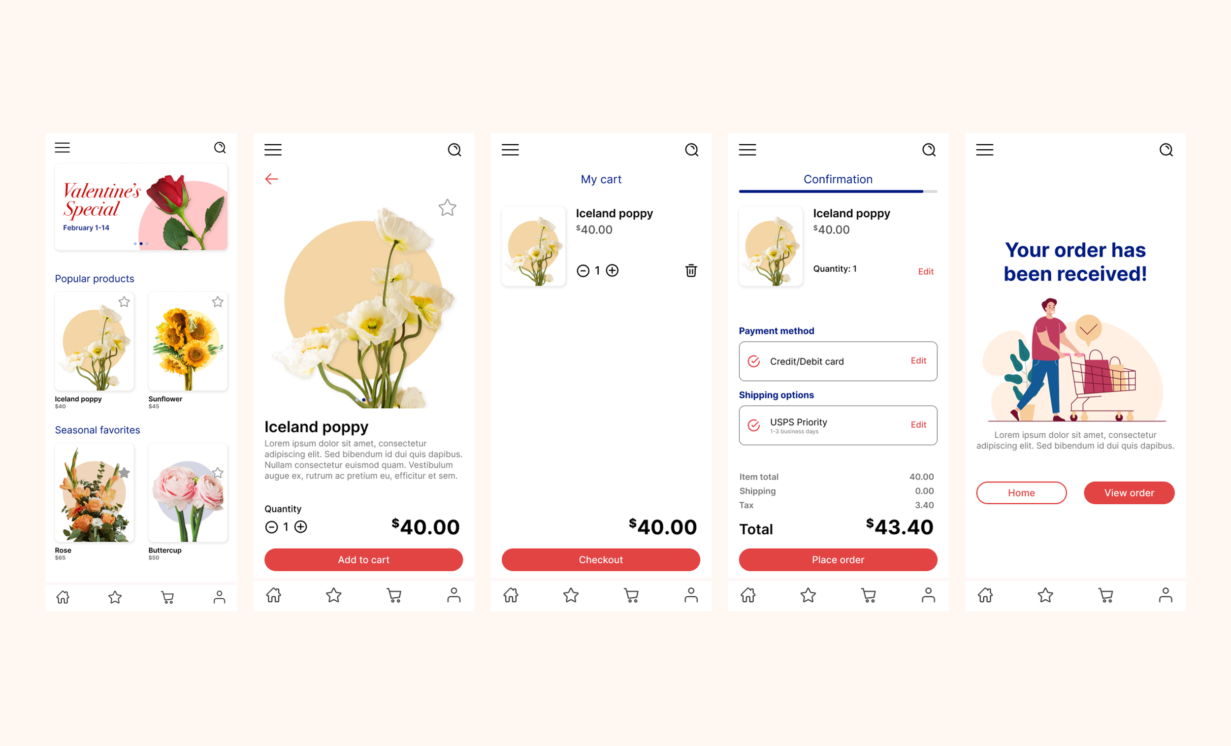
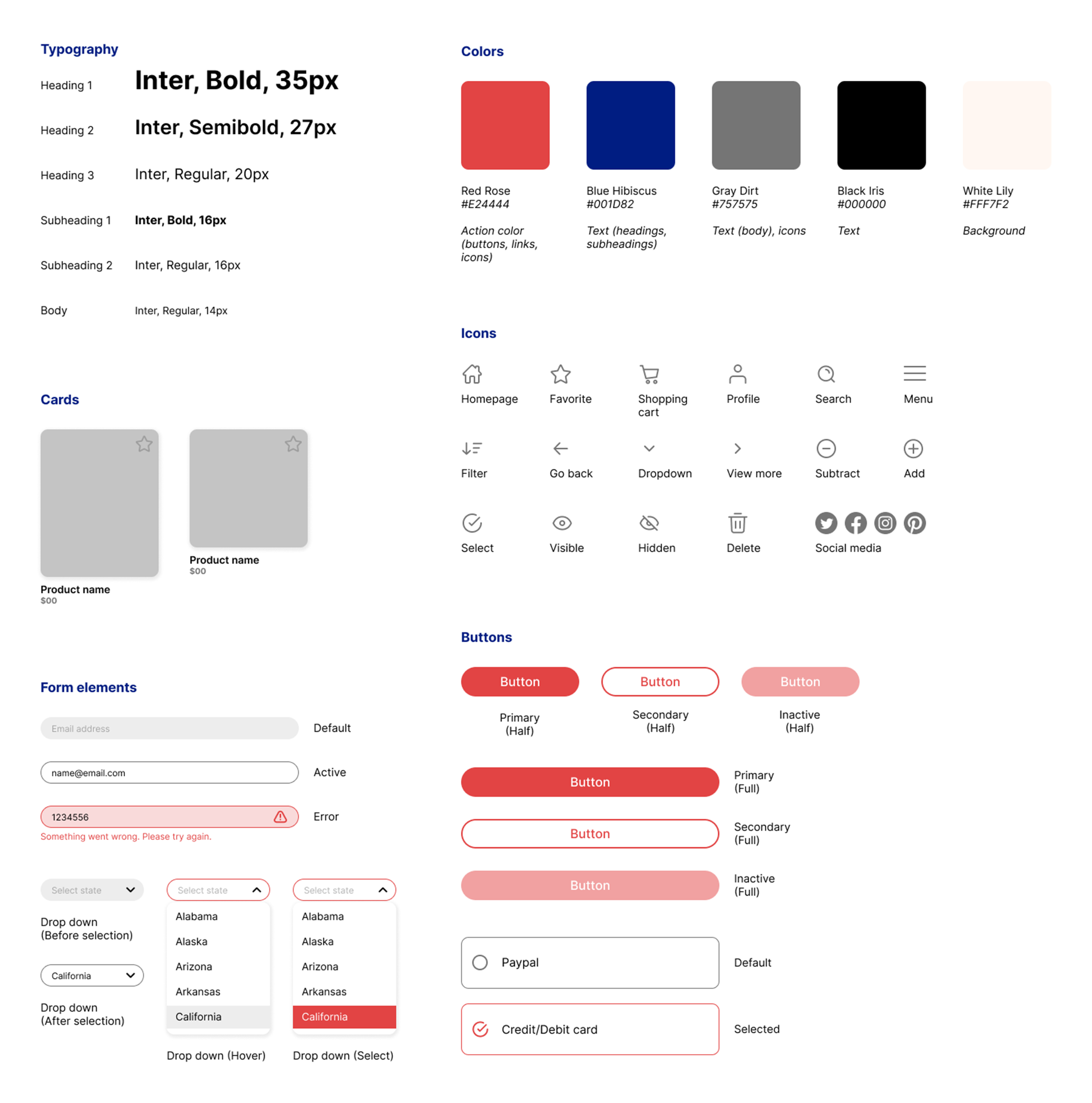
In order to have a consistent design across the entire app, a style guide was created.
The chosen colors are inspired by flowers and nature.
Rounded corners for buttons and images were used to appear more approachable.
A typeface that is simple, easy to read, but doesn’t bring too much attention to it was chosen to direct focus toward the product images instead.
Universally recognized icons help simplify the user interface and make navigation easier.
High-fidelity prototype
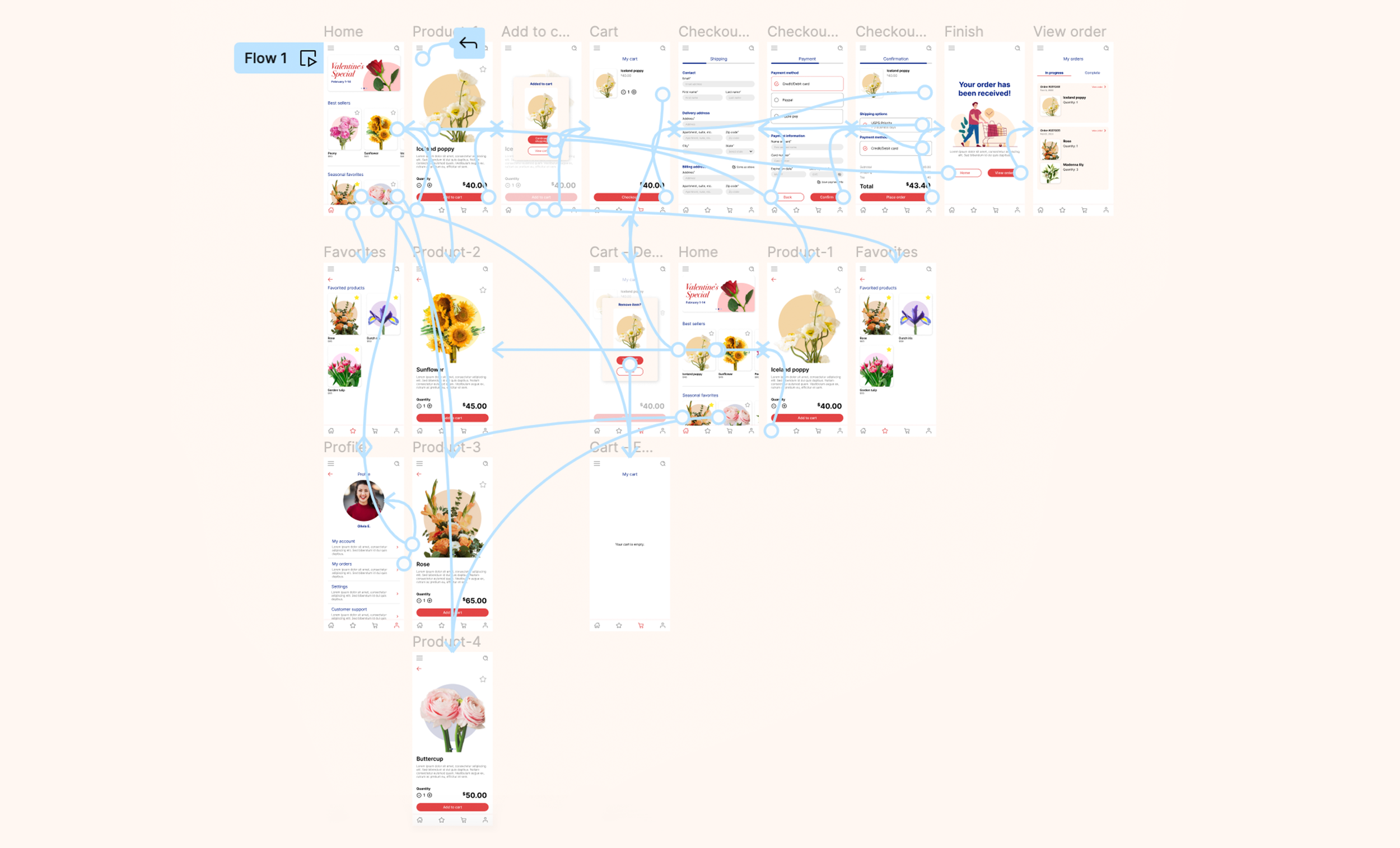
The final high-fidelity prototype features additional screens such as a “View order” page and an updated home page with the products in a carousel system to fit more products onto the screen.
Usability study 2
Usability study: overview
A second round of remote, unmoderated usability testing was conducted using the high-fidelity mobile app prototype. The study involved a new group of 5 individuals located across the United States.
Users were given instructions to follow and a set of questions to answer after completing each step. Users were told to add a specific item to the cart and complete the check-out process.
Usability study round 2: findings
Round 2 findings
4 out of 5 users would view their order right after completing a purchase.
Large product images allowed users to easily find the specific item they were asked to add to their cart.
Additional screen sizes
During both rounds of usability testing, I noticed that some users preferred to do their test on the computer, while others used their phone. This led to the idea of creating a responsive website so users can access Fleur on whichever device they prefer.
Responsive website
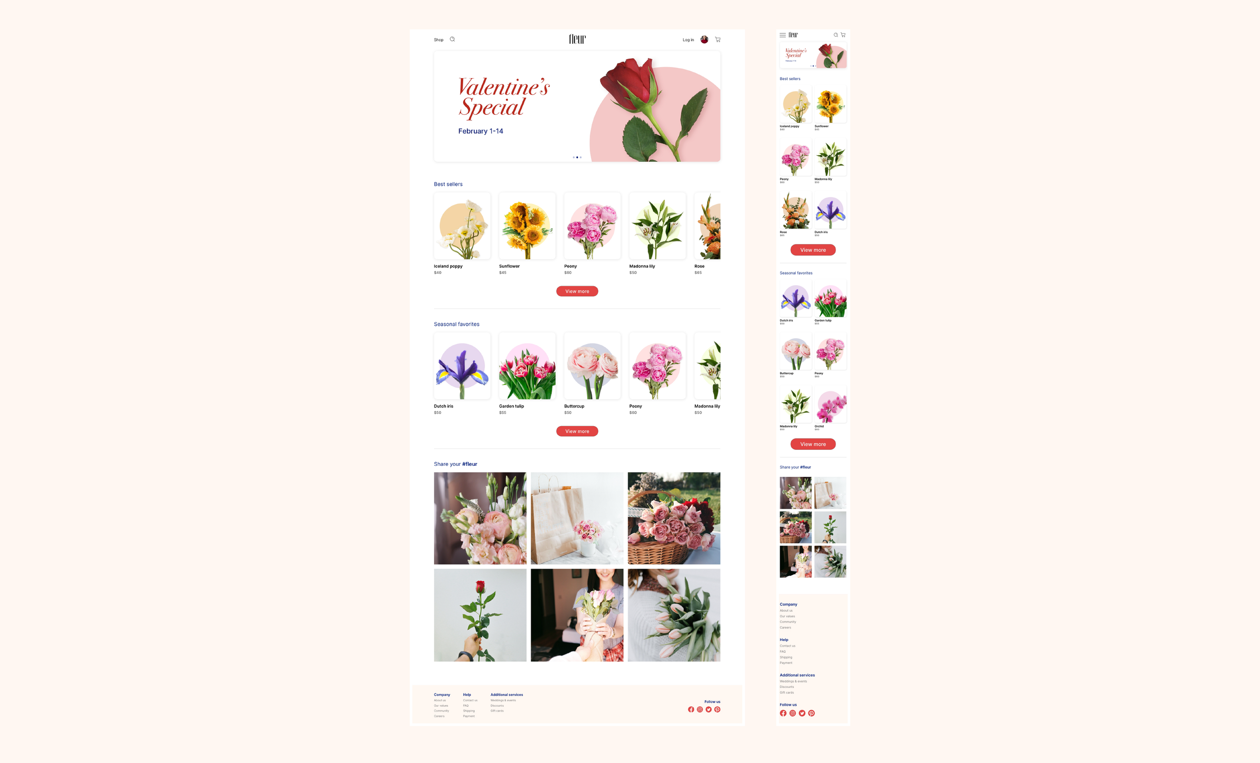
Repeating the process that was used to create the mobile app, a responsive website for Fleur was created.

Conclusion
Impact
Compared to existing flower delivery services out there, Fleur offers both a mobile app and website whereas the current existing flower delivery services out there only have websites. Fleur also has an easy to navigate interface that utilizes large clear images and text, allowing users to easily browse and find what they need.
“It's a very straight forward app. I would use it to purchase flowers” - Roger
“I like that the products are big on the screen” - Tracy
What I learned
While designing the app, I realized that we can’t predict what the users’ response to the app will be. Usability tests and peer feedback are important to understand issues that weren’t anticipated.
Improvements
Some next steps I would take to further improve Fleur would be to:
Polish up some of the UI details in the app and website.
Do another round of user testing to make sure previous problems have been addressed.
Add more content such as a subscription service.